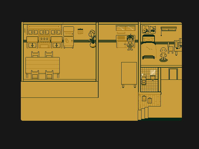
Updated look of the game

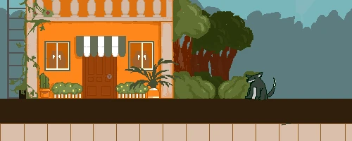
Old Look of the game

I'm not dead (yet) yay! College has been really hectic lately and I'm trying my best to do it all at once
Anyways I've been making some changes with the game environment. As you can see from the latter, I was just half-assing the game's art and I can't stress enough at how bad it is, though the dog looks pretty cute. I decided to take it more seriously and think about the player's perspective of the game. And I've come to a conclusion of a top down pixel game! This is my first time trying out pixel art styles (っ^▿^)so if there's any criticism feel free to comment!